
How I Slowly Went From PDF Repository to Redesigning My Moodle Course's UX
The first time I ever touched Moodle was during my master's program. One of my professors had us design a Moodle scavenger hunt so we could play around and explore the platform, see what was even possible on there. Looking back, that's kind of funny, because maybe one or two of my courses that whole program actually had a Moodle page. It wasn't something I needed to use.
That stayed true when I started teaching in Berlin. My first two semesters, I didn't touch it. AT ALL. I knew I needed a type of website, so I used edublogs (remember those??) to create one. The first time I actually logged in to Moodle do something was to send my students a notification that I was sick and class was cancelled. My real first attempt at building out a course, sometime around late 2018, was just a repository of PDFs and links. Upload the worksheet, done, move on.
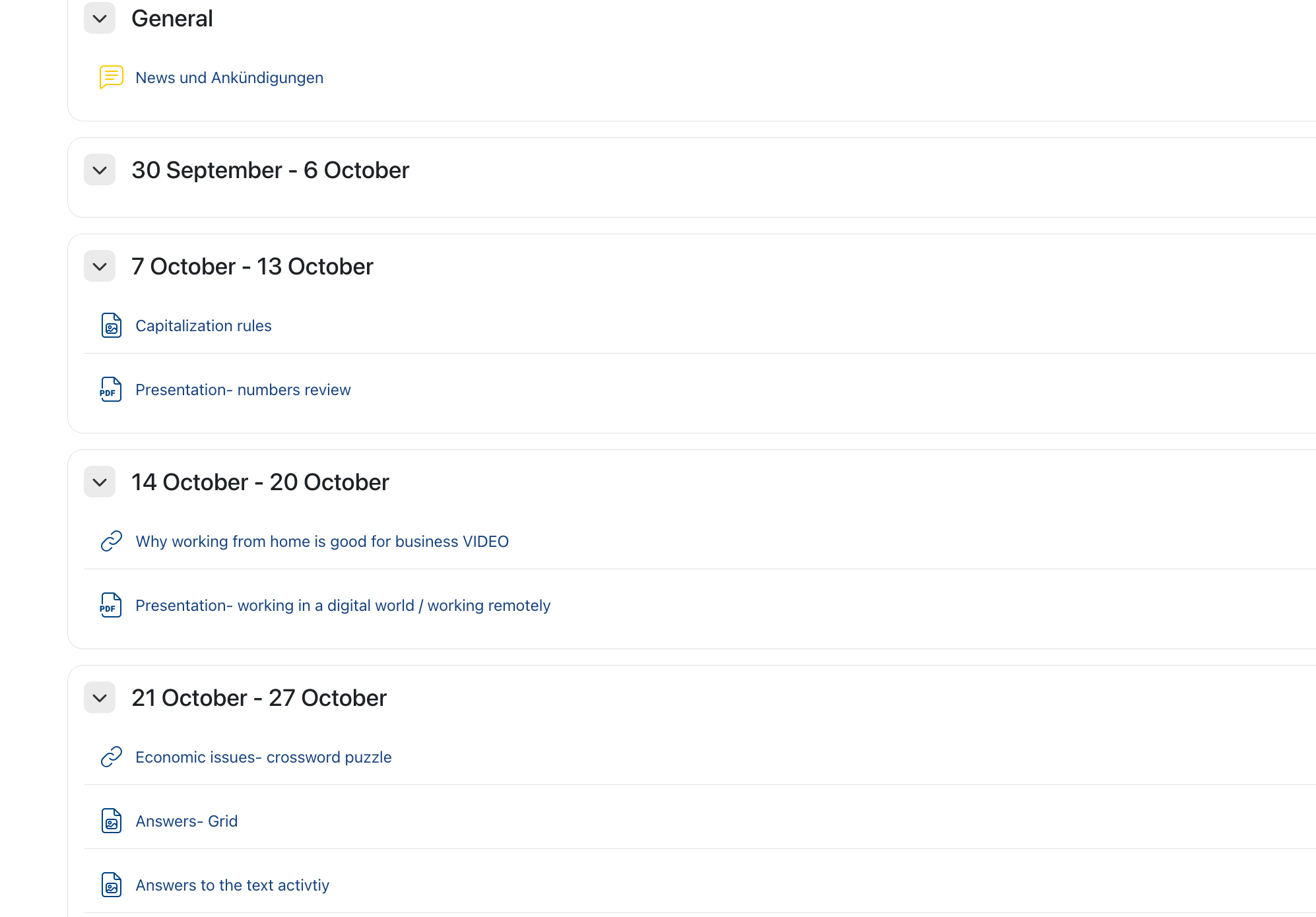
See? Links and PDFs for days!
A lot has happened since then. Moodle is now an integral part of how I teach, and I didn't realize how much of my prep time each week/semester would end up going into it. Just this past semester, a student mentioned in one of his reflection videos [link to that blog post] that he had no idea a Moodle course could do this much (!!!!!!) none of his other classes used it beyond the basics. I've been using Moodle for almost a decade at this point (another !!!!!!!!!!!!!!), and it's still taken me this long to actually use most of what it offers. And every update brings new tools I have to learn, so the redesigning never really stops.
What follows is a bunch of experiments across different courses, testing different Moodle course formats with the hope that it will help you find one that works for you, or offer you a bit of inspiration.
Wait, What Is "UX," Actually? And “UI”?
I didn't grow up with this word in my teaching vocabulary. My life has always revolved around lesson plans, SMART goals, test items… you get the picture. I had lived through frustrating UX/UI, but was able to actually name it once I started teaching Business English and English for technical students. UX, short for "user experience," and UI, "user interface," (which I honestly used to think meant more or less the same thing) kept coming up in their world, in their vocabulary lists, in the case studies we'd work through together.
UX is about the experience of using something → can you find what you need, does the structure make sense, do you know what to do next without having to ask someone. It's the wayfinding layer, the logic underneath.
UI is what that logic looks like → the colors, the layout, the buttons, the visual style. UI is what you see. UX is what you feel while using it.
Good UI can support good UX. So a color-coded dot helps a student predict what they're clicking, which is a UX win delivered through a UI choice. But UI on its own doesn't fix a confusing course. You can have the prettiest color scheme in the world and still bury your attendance policy on a page nobody can find.
While we all think about the UI/UX of our classes in way or another, it took me a while to realize the same question applies to my own course page. A Moodle course is, in a very literal sense, a product my students have to use every week. If the UX/UI is bad, it doesn't matter how good the content behind it is. Students will spend their energy hunting for things instead of learning from them. A confusing course adds a tax on top of an already demanding class: now you're not just learning English, you're also playing detective on where the homework link is hiding. Good UX/UI doesn't teach anything by itself, but it sure clears the way for everything else.
The Problem I Kept Running Into
My Moodle courses way back when didn’t even include basic course information. I’d upload a worksheet or reading material here and there, but it was never something consistent. It was more of an afterthought. When I finally realized Moodle was useful, I started to include more and more. This lead to my info being scattered everywhere: attendance policy on one page, course program on another, requirements somewhere else entirely, FAQ buried where nobody clicked (I added the FAQ section just recently). If a student wanted to know what book we were using or how they could email me, they had to already know where to look, which, of course, they didn't.
And it wasn't just a student problem. I'd open my own course/s mid-semester looking for something and lose two minutes hunting for it myself. If I was confused, I had no right to expect my students not to be.
So across a different courses and semesters, I tried some different course structures and formats.
The Plain Accordion
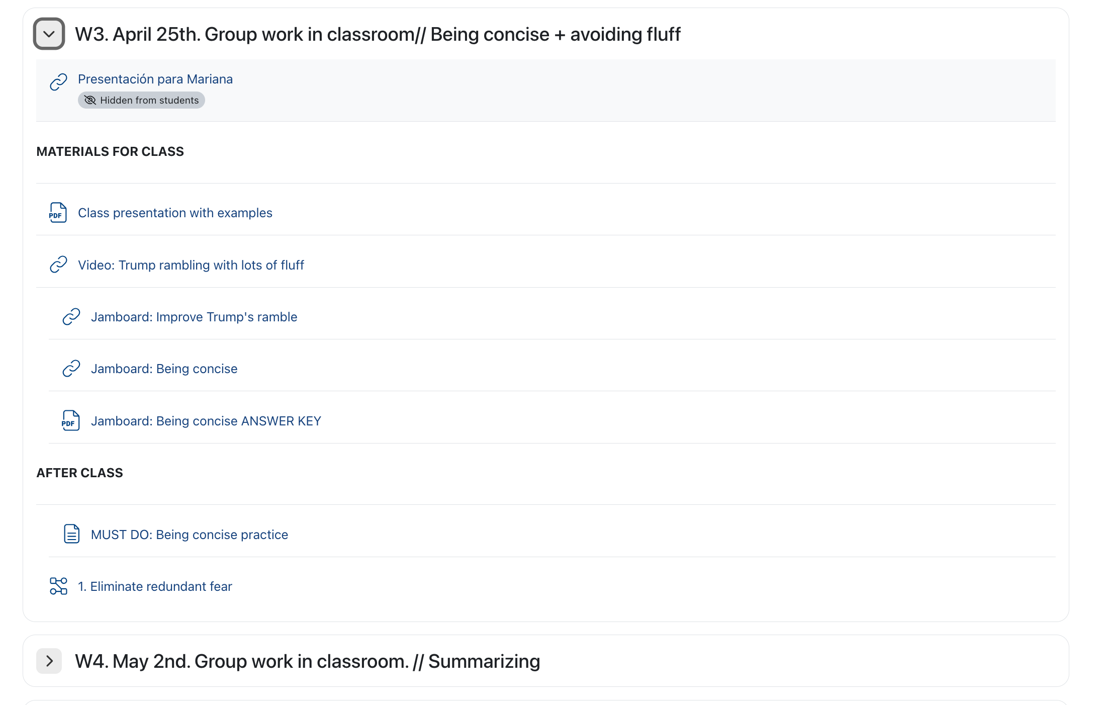
I started simple, tying everything to a weekly or topic-based format: Back then, sections were not even collapsible, so you can imagine how crowded it looked. In terms of dates, I always kept the oldest at the top, newest at the bottom. It worked, in the sense that students could find a list of weeks. This is what most of my earliest courses looked like
The Grid of Cards
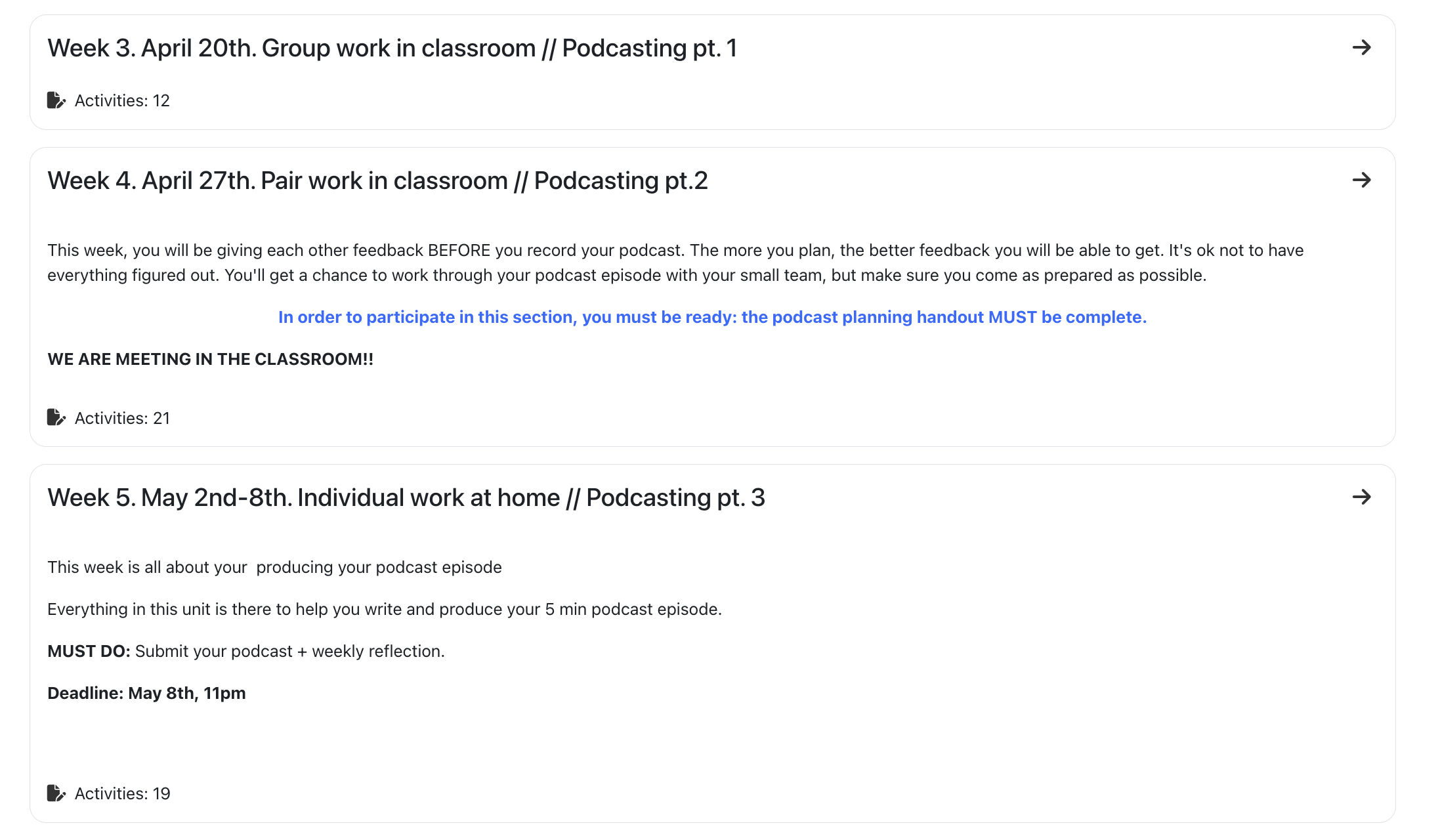
At some point I moved to a visual grid instead: colored tiles for each week, GW (Group Work) in one color, IW (Individual Work) in another, laid out like a calendar you could scan at a glance.
It looked good, I remember an exchange student from Brazil named Ramiro even told me he liked it. This format only lasted a semester. Two reasons: it was too visual for information that's actually text-heavy (a colorful tile doesn't tell you much once you're three sub-tasks deep into a lesson), and it just didn't scale. Once a course had more than a handful of weeks, the grid turned into a wall of near-identical tiles that were hard to tell apart at a glance, which kind of defeated the whole point. I could have designed a tile for each week, but who has time for that? I did not.
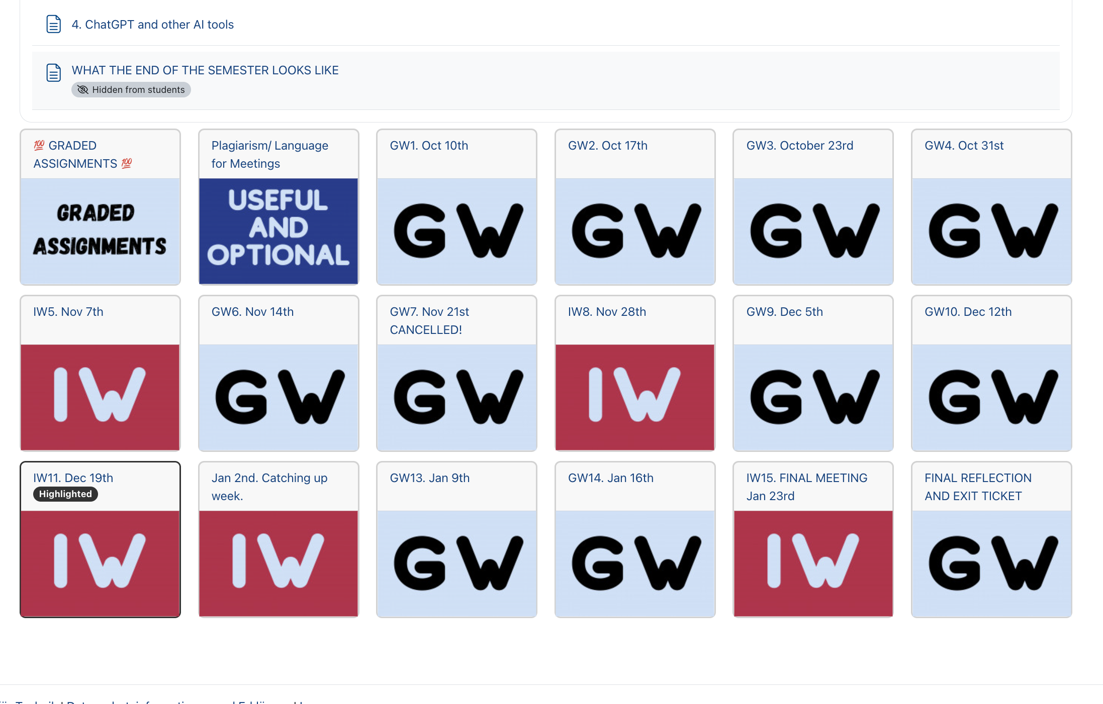
GW- means “Group Week” and IW “Individual-work Week”. I don’t even know what was going on here.
The Plain Accordion
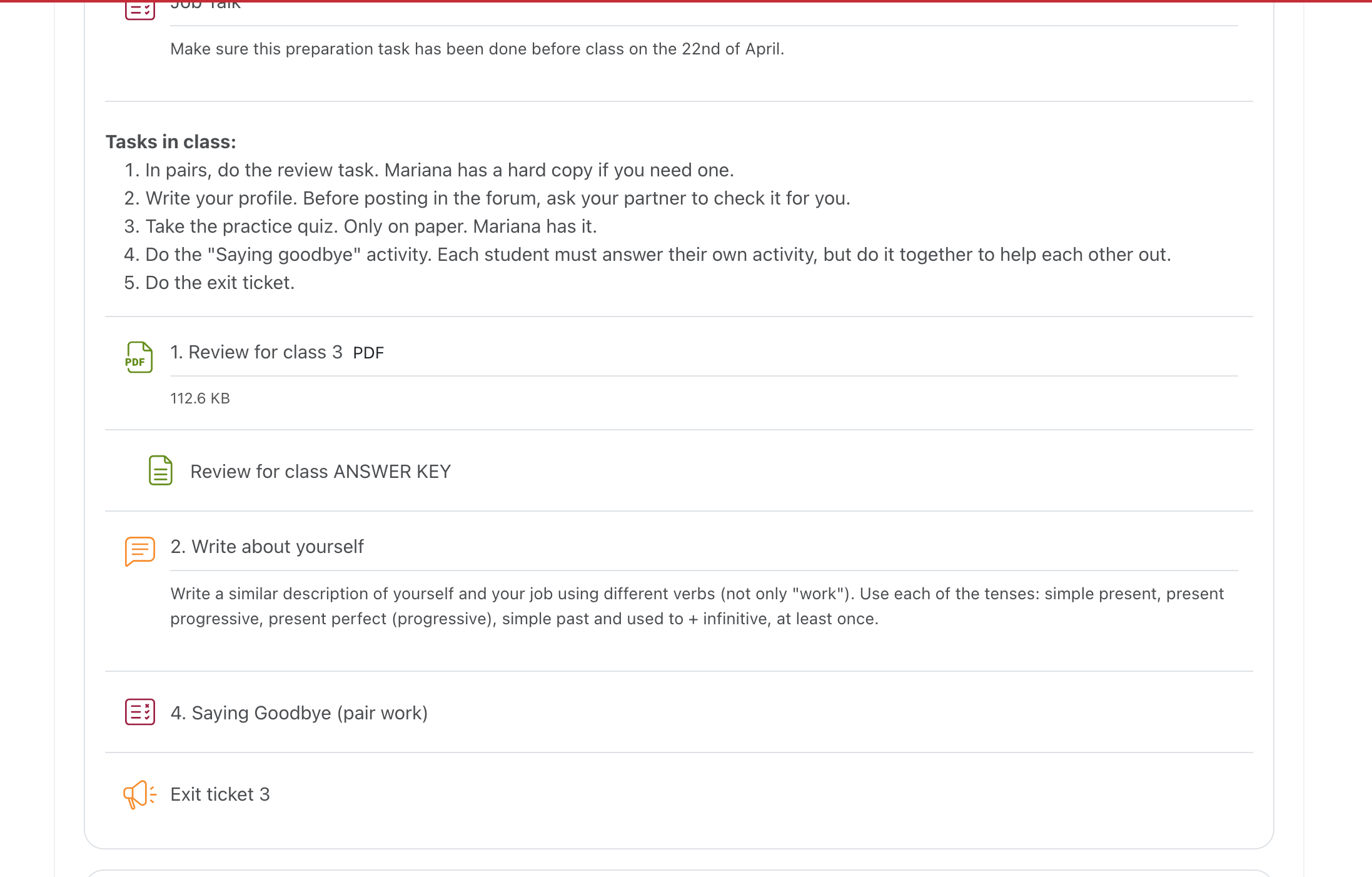
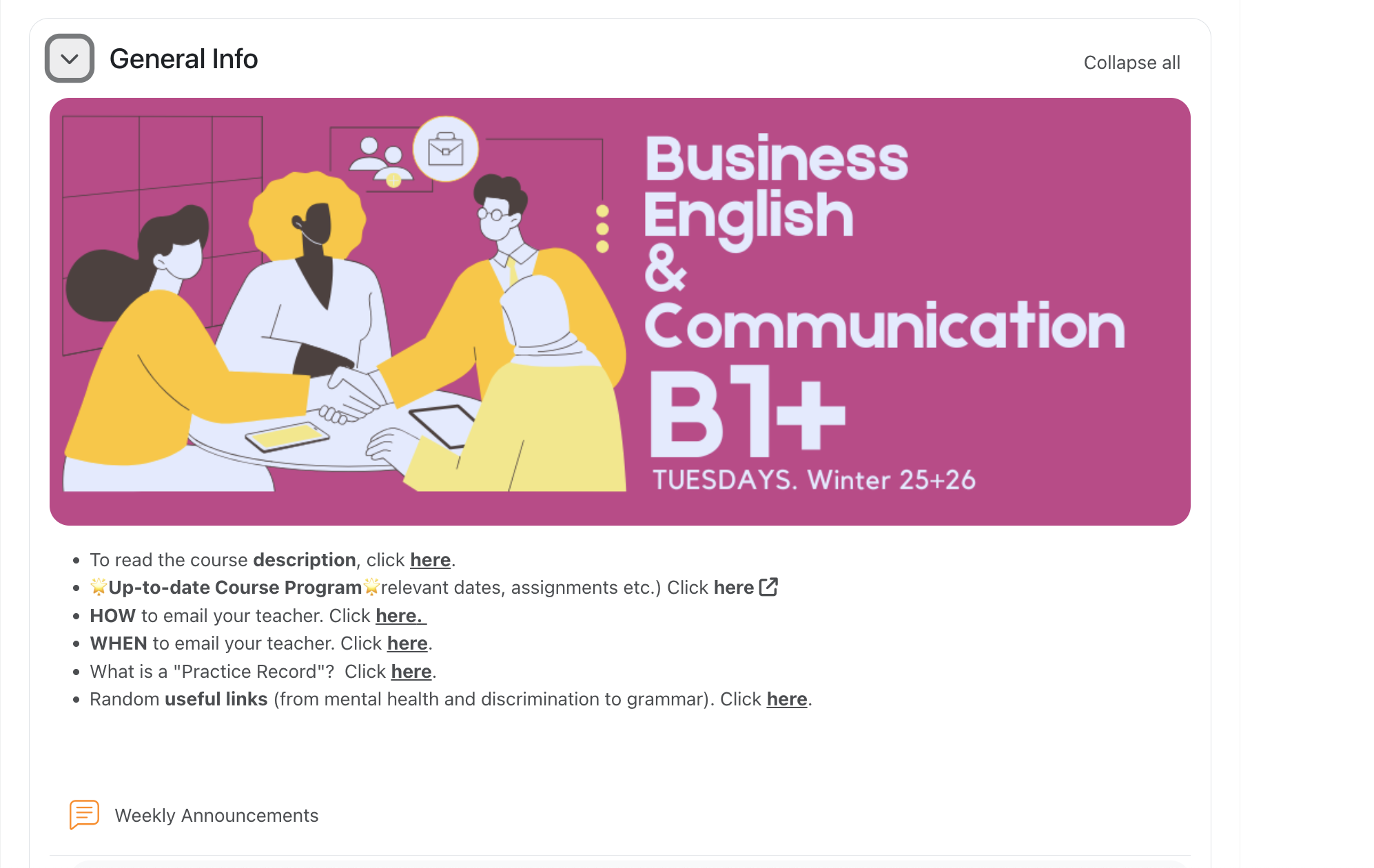
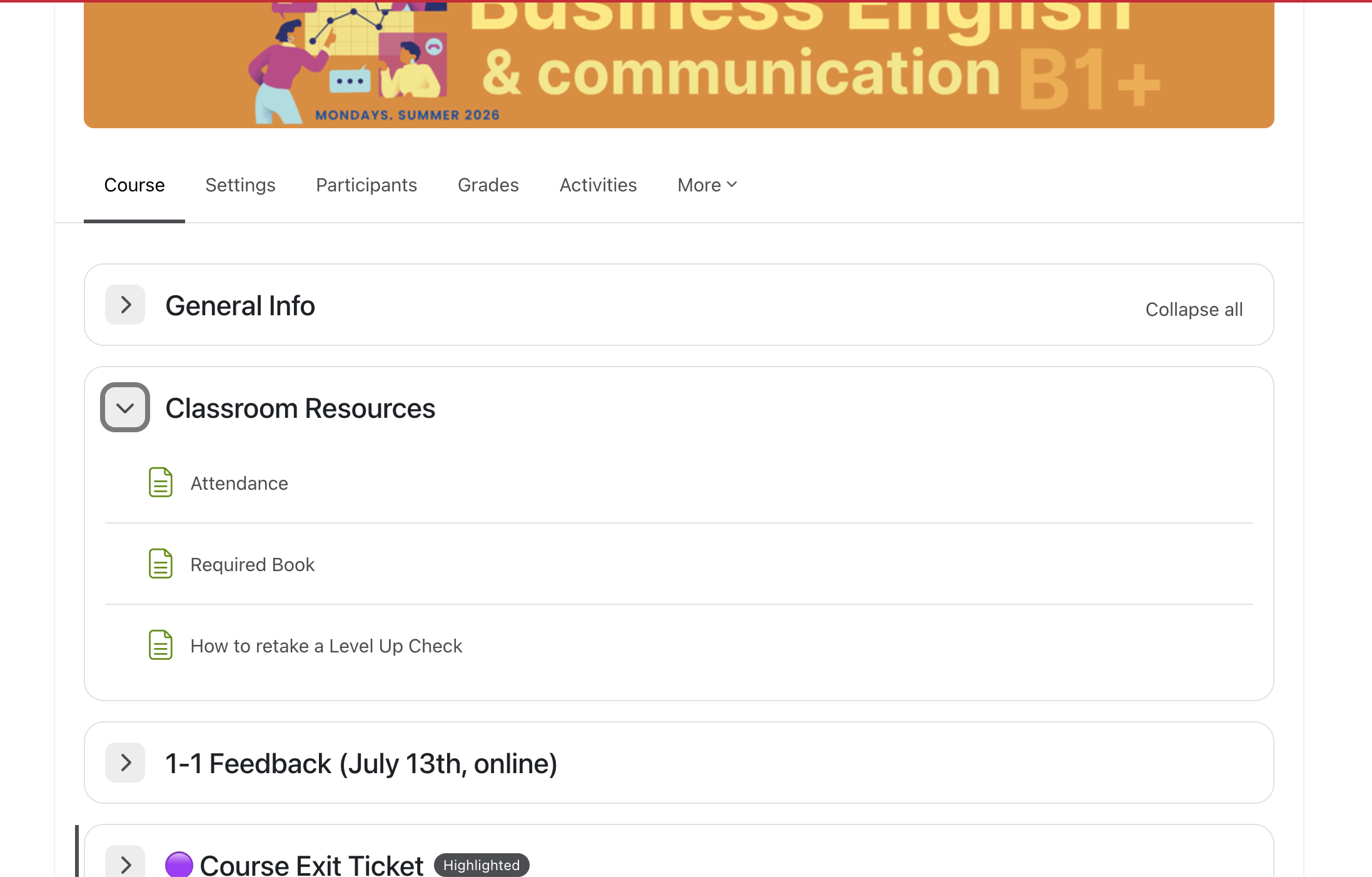
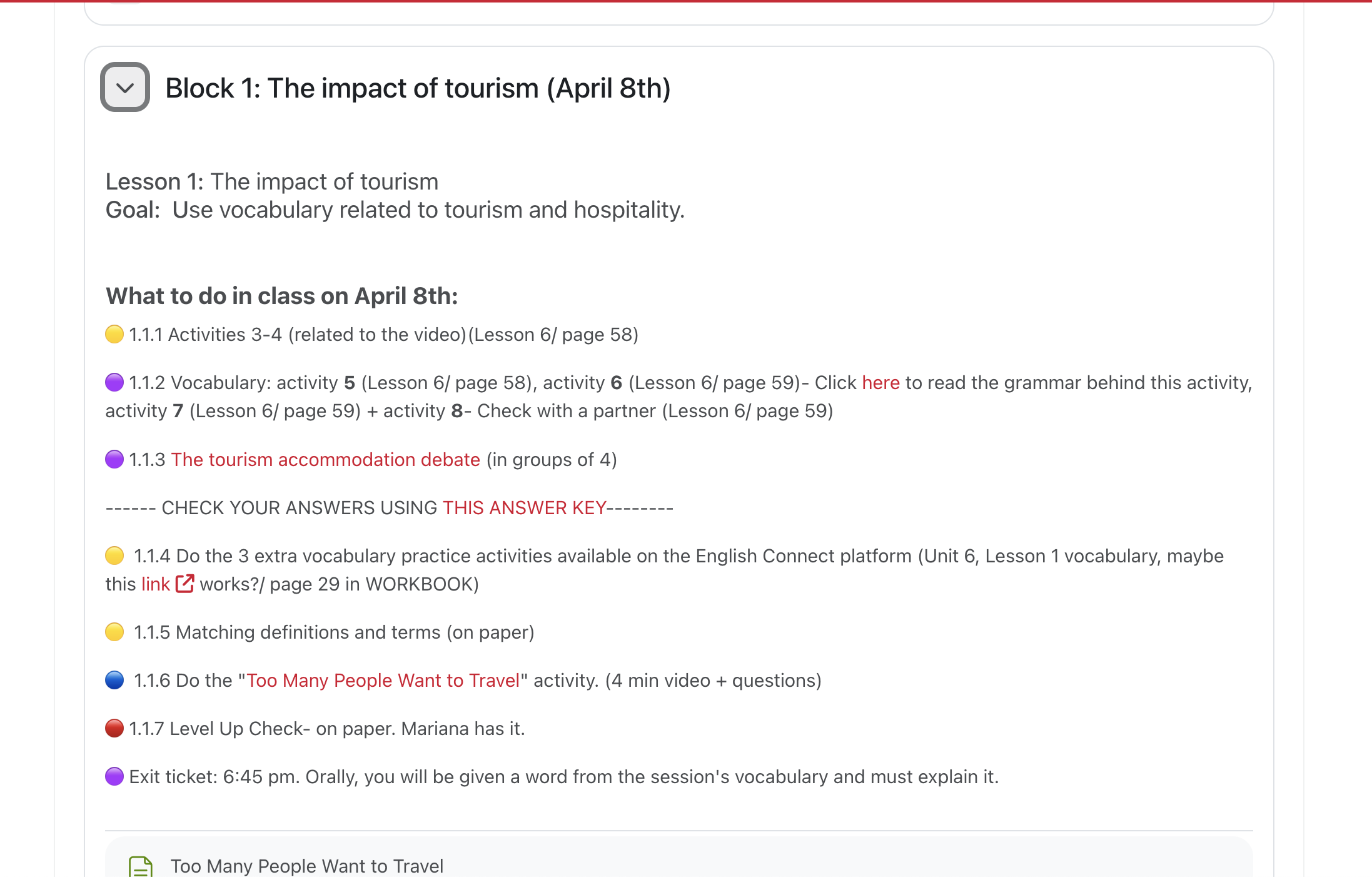
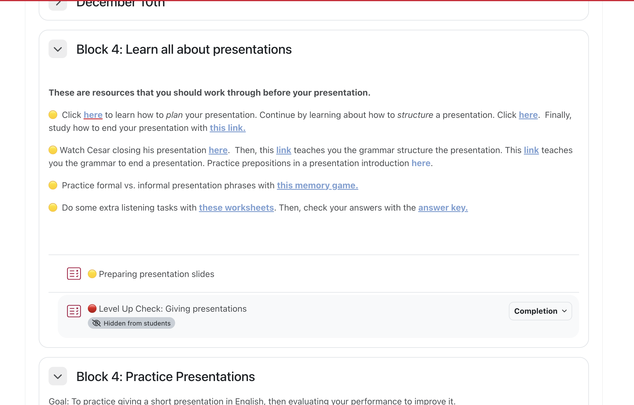
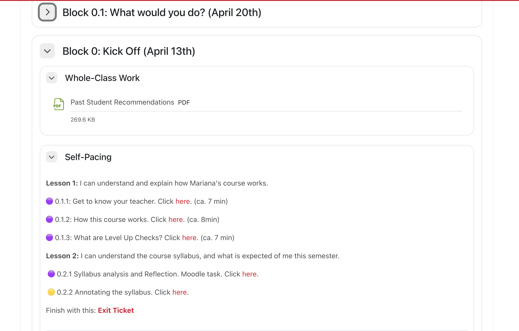
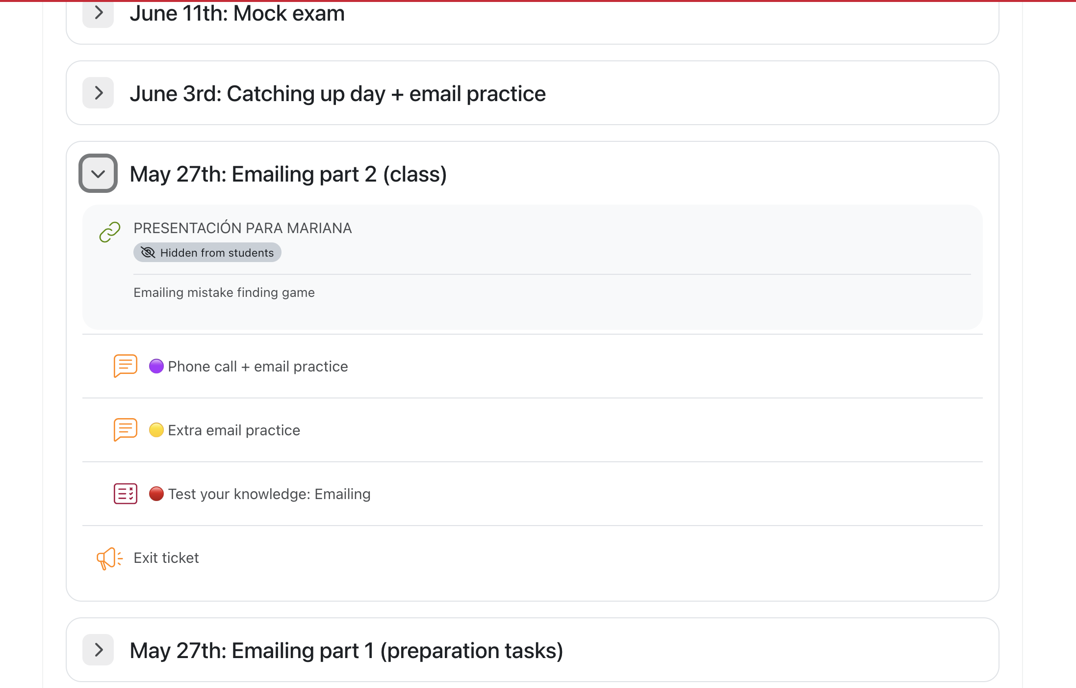
After the grid, I circled back to the topic/weekly format. I tried to be more thoughtful with how the information was organized. Every semester, it improved a little. I worked hard on the reasons behind my choices, and worked on designing actual structure behind it instead of just a flat list. This was around the time when I discovered blended-, flipped-elements, and I started including self-pacing. So of course, being the person that I am I began color-coding eveything: giving each activity type its own visual marker so students could tell what they were looking at before clicking.
And with some of the more recent Moodle updates, I started using subsections within a section, so instead of one long list per week, a topic could hold its own smaller groupings (prep tasks separate from in-class activities, for example), without needing a whole new tab or block to do it. Some of my courses still follow this format as I haven’t had enough time to devote to making the shift.
One thing I'm still not fully settled on: newest-content-first, top to bottom? or old-content-first? I like being able to find "what's due this week" without scrolling. I'm not sure students read it the same way.
See if you can spot which course was before and after in the gallery below.
Tabs With Colored Blocks
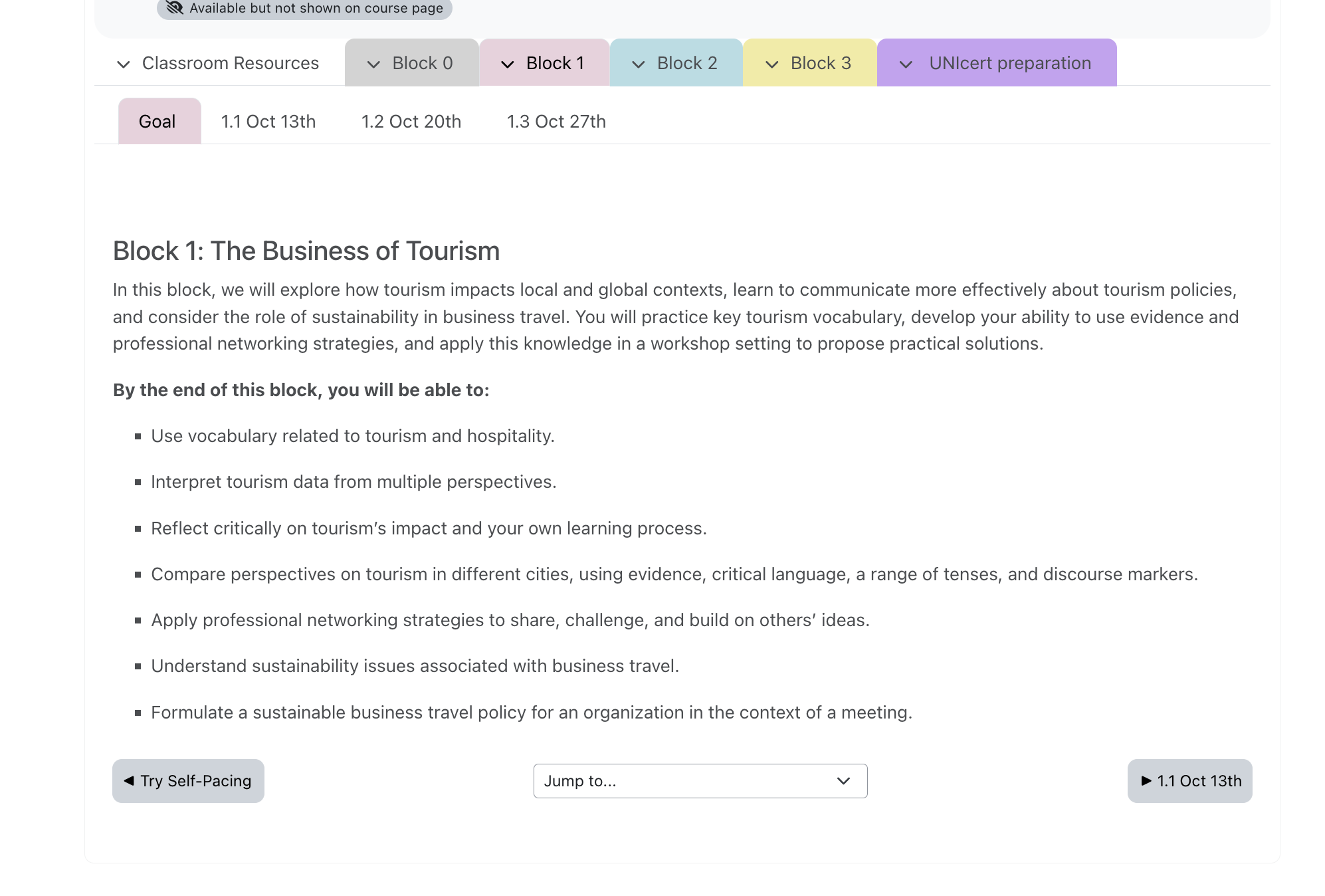
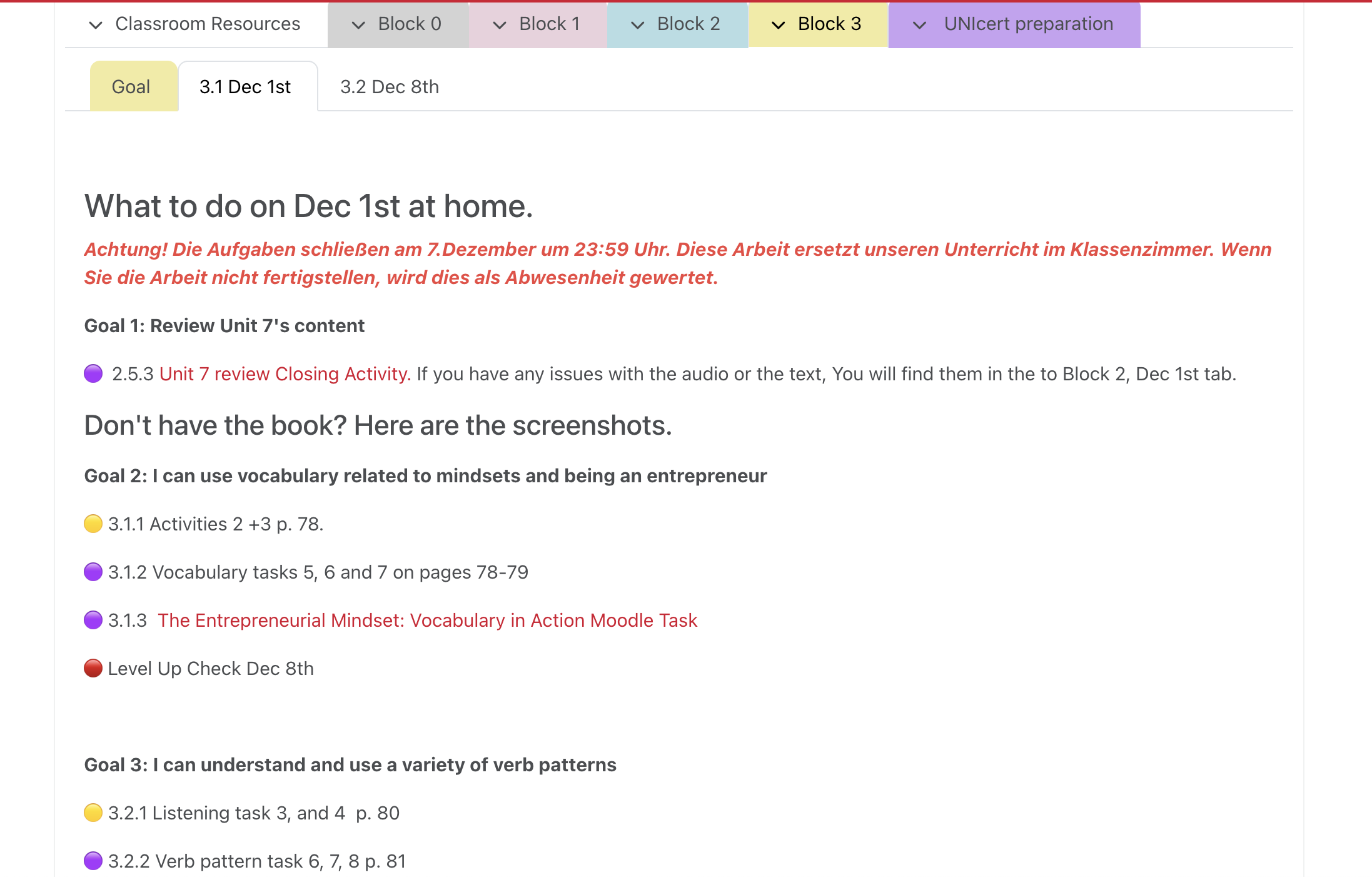
More recently, I tried horizontal tabs across the top of the course, with my blocks each in its own color. Inside each block, a second row of tabs breaks things down further: a "Goal" tab stating the learning objective in plain language, then tabs for each specific date.
This format is the most time consuming to edit and maintain IMO. It’s not as straightforward as the other ones.
Sidebar Blocks + The "Our Course" Book ← the current format
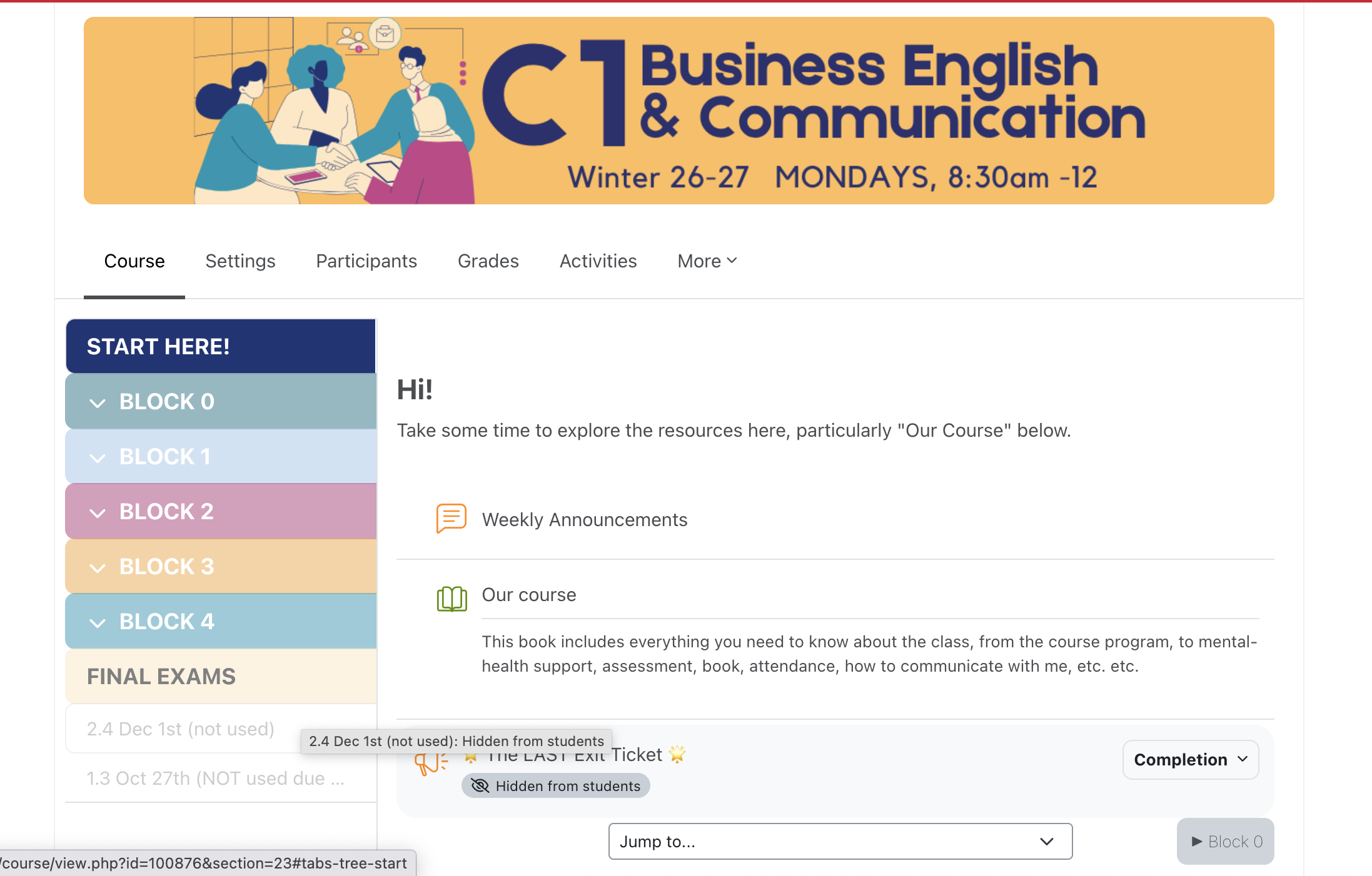
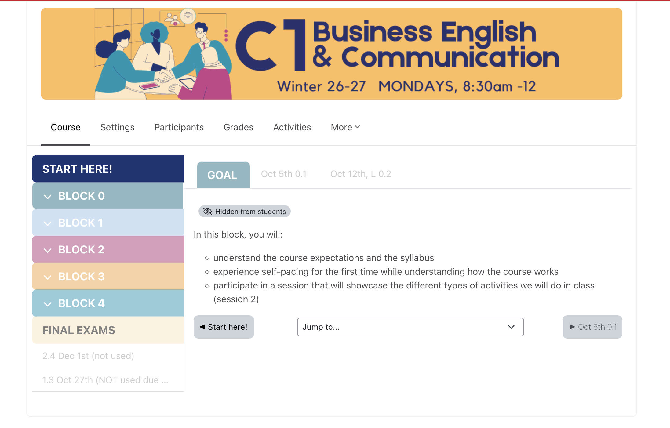
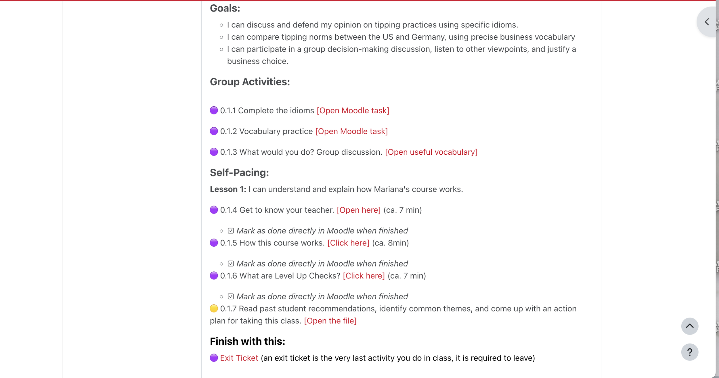
My most recent course (Winter 26–27) uses a different structure again: a vertical colored sidebar.always ordered oldest-to-newest, so the sidebar reads in the same order students actually move through the semester. I don't know yet how it'll work. I haven't started the new semester, so I have zero outcome data, no "student engagement went up" claim to make here. What I have is a hypothesis built on two pretty unglamorous reasons: students weren't finding information, and I was bored and occasionally lost in my own course.
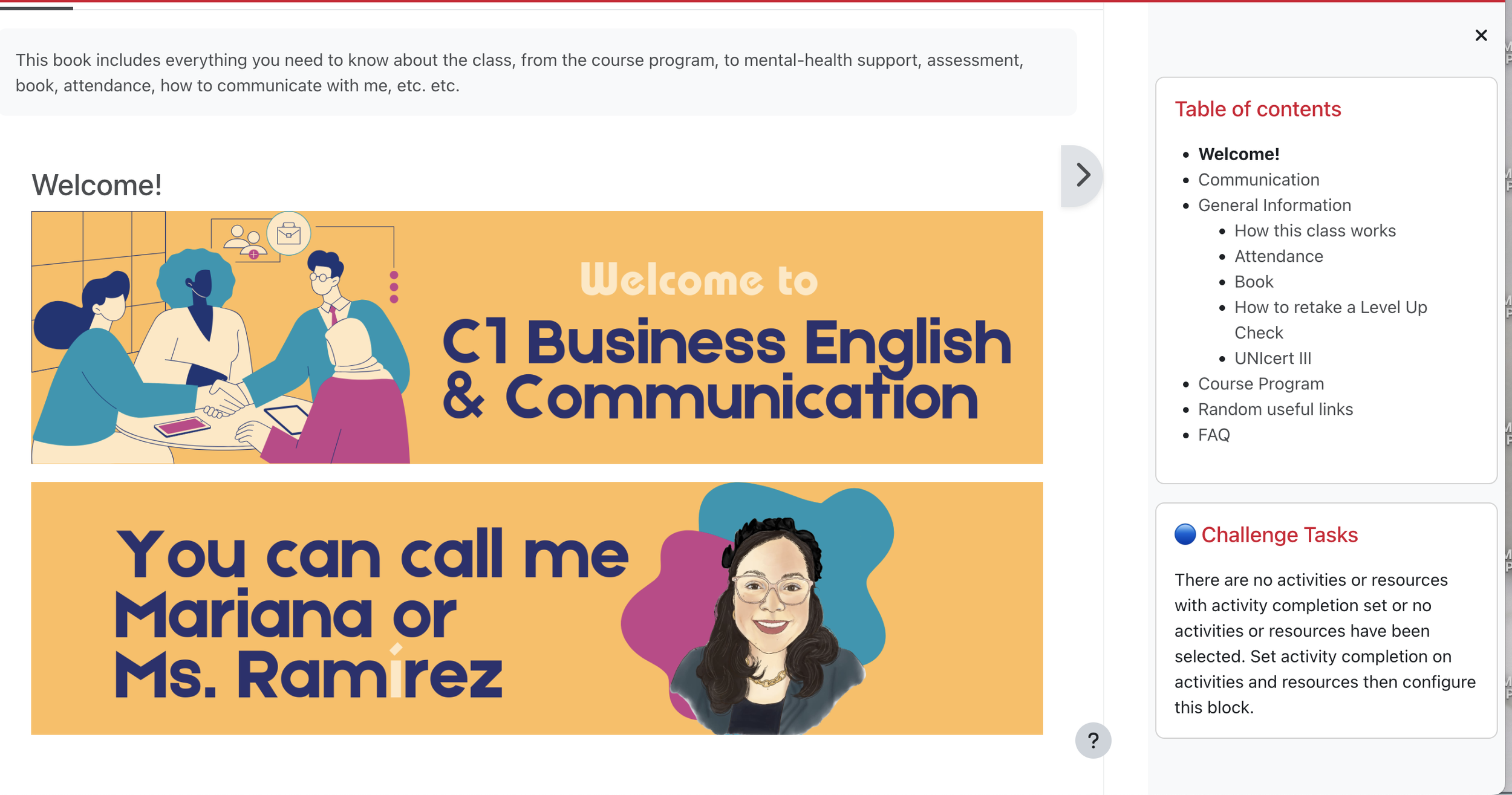
This version also introduced the single biggest fix for the "everything is scattered" problem: the "Our Course" book. Did you know Moodle had books?? I did not. It is the one consolidated resource holding the beautifully embedded course program, mental-health support info, assessment breakdown, attendance policy, how and when to email me, and the FAQ, all in one table of contents instead of five separate pages.
Oh, and I finally standardized my link text, wrapping every link description in brackets like [Open Moodle task] or [Open forum], so students actually know what they're about to open, and it is clear it is a link.
I'll follow up once the semester's underway with what actually happened, but in the meantime, can we all appreciate how beautiful it looks!??!??
Looking Back at All of This
Writing this out, and going through years and years of Moodle courses made me sit with something I hadn't really looked at directly before: how much I've changed as a teacher, not just as a Moodle user. The person who uploaded a folder of PDFs in 2018 and called it a course is not the person building goal-based, self-paced blocks with color-coded activity types in 2026. Maybe that "who I am as a teacher" story, deserves its own post at some point. You know, that what I used to do in the classroom versus what I do now, and everything in between that got me here. But not today.
I have always wanted, deliberately, to become a better teacher. That intention was there from the start, and that reflects on my Moodle (as you can see, I am quite proud of it atm). This goal of wanting to do better for my students, of each redesign, is also fed constantly by something annoying me, by student feedback I collected every single class and again at the end of every semester, and by my own boredom, that itch to keep learning more even when nothing was technically broken (often to my own detriment).
I also notice I used to think of "redesigning the course" as a project with an end point that you do once, and are done. It's clear now that's not how it goes, at least not for me. Every semester I know a little more, Moodle changes a little, and what used to feel like the finished version starts looking like just another draft. I used to find that a bit exhausting. Now I think it might just be what teaching actually looks like, if you're paying attention.
While this post wasn’t planned as a growth reflection, I guess it just turned into one. Redesigning the same tool over and over, for almost a decade, has a way of showing you your own evolution whether you meant to look at it or not.
Want help redesigning your own course's structure — Moodle or otherwise ? That's exactly the kind of thing I work through in my Digital Content Creation for Teachers workshop, or one-on-one in EdTech consulting.